Each comic artist (I like to say“comickers”) has his or her own personal work process, even though it is rare, in this comic industry, to find someone who handles every step of it from script to finish.
Most publications are the work of a team, with a specialist assigned to each of the main stages: writing, layout, pencils, ink, color. It looks simple, but in reality there are steps within steps, depending on the comic itself: inserting speech bubbles, texturing, shading, special effects....
As an independent comicker, I handle all aspects of my story. I invite you to a quick walkthrough of my work process, which has its peculiarities. It’s not a course in making comics, but you may find some useful tips along the way.
You can also download this presentation as a pdf.
STEP 1 Synopsis
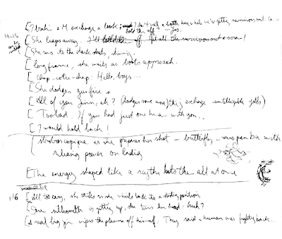
Before anything else, I write down the scene and dialogues. The horrible handwriting means I am trying to catch up with my ideas as they hurl themselves on the paper! Since I’m the only member on this team, presentation doesn’t matter: I didn’t even bother describing the panels here, only the dialogue. If I have a brilliant idea I’m afraid I’ll forget, I do write a description, and even make thumbnail sketches of what I see in my mind’s eye. When a team is involved, the writers put much more presentation work into this step, describing the most important elements of each panel, their “camera angle”, even the atmosphere and attitudes they need the artist(s) to pull off. Anyone who is then handed such a script would know exactly what to do.
Several weeks may elapse before it’s time for me to draw a scene after I’ve scripted it. This gives
me a fresh outlook on it and I often rewrite it or the dialogues. I divide the text where I feel a page should end and a new one begin. A page should always end in a logical pause or a cliffhanger, especially when it’s the right-hand page. For scenes that require an extra oomph, a spread (2 facing pages) can be planned as a single unit (known as a splash page). What this all means is that the left- or right-hand position of a page is also an important decision, which I have to make at this stage, because I may have to expand or shorten parts of the synopsis to make pages fall where I want them to.
I then use brackets to break down each page further, into what will be the panels. This is also a matter of feel and depends on the mood and tempo of the scene. For instance, if a question is
asked by a character and answered by another in the same panel, you have a regular conversation. But if the answer comes in the next panel, a pause is implied – the second character was slow to respond. These are very subtle details, but they are the key to storytelling.
My brackets also help me see at a glance if I have too many or too few panels on my page. The
European format I use would theoretically allow me up to 12 panels, but it’s a good idea not to go to that extreme unless some of them are really tiny. I’ve seen pages in American comics with one single panel, but I feel they are weak unless used only for exceptional scenes. I keep to something between 8 and 10 for average pages, spread on 4 rows. Naturally, I break out of that partially or completely as the story dynamics require.
STEP 2 Sequencing
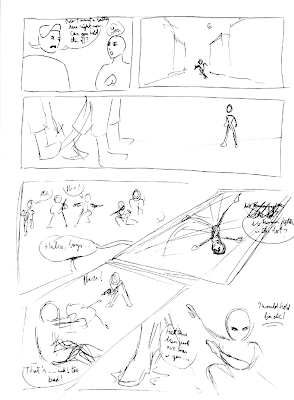
This is the birth of the comic proper. Sometimes I know exactly how the page should flow, others I have to sweat for a long time until I can decide on how to sequence the story. Most of the time it’s somewhere in between – there are specific moments I want on the page, and the rest needs to be worked around them, bulding up to them or otherwise giving them the spotlight. In this
example (p14 in vol.2), the page culminates in its last panel, where both the character and the tension are fully charge and ready to explode. I can already see that I’ll want to make it larger in the final layout.
This is where the magic of the panels is wrought, each individually and all together as a composition. Many things have to be considered: pace, legibility (leading the eyes through the panels in the correct order), variety (in the sizes and proportions of the panels but also in the “camera angles”), energy (a page can be serene, speedy, explosive, overbearing...) relation to the previous and next page, etc. I also scribble the dialogues in to see how much room I should expect the text to take up.
It usually takes more than one attempt to finalize the sequence. The first draft is mostly for me to get a general idea of what I can do and whether I have a good number of panels. If there are too many, I shift some over to the next, looking for another point where I can logically break the flow. If that’s not possible I may simply eliminate some. Inversely, if the page is too empty, I may bring panels over or insert some. Such changes must be done without weakening the elements
mentioned above in this page or the next, so they come with much hair pulling.
Some comickers prepare their sequencing very carefully, down to the study of light in each panel. It’s a smart thing to do when you’re going to draw and ink it on paper, where there’s little room for mistakes and fixing them. Personally I just capture the essential elements in each panel at this point, because I proceed differently and don’t have to commit to the layout yet.
STEP 3 Layout
This is where my work process gets really unconventional.
When I first started creating comics, in pre-computer days, I followed the steps Hergé (father
of European comics and one of my first inspirations) used for himself. On a large piece of
low-quality paper, I prepared the layout and pencilled everything (a conscienciously messy
operation). I then transferred my final lines, using tracing paper, to a sheet of watercolor paper
where I had prepared a clean layout of the panels. I inked it with much trepidation (mistakes
were not redeemable) and then erased the pencil lines. Finally I colored it using artist’s ink. It’s
a method that has its advantages, but on the whole it was constraining, time-consuming, and
forced me to take irrevocable decisions early on in the process.
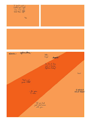
Nowadays I prepare the layout in Adobe Photoshop, based on my sequencing, using shapes.
The document’s actual size is A3 plus bleed margins, defined by guidelines (the reason I use
A3 while my printing size is A4 is to leave the door open to possibilities of printing large pages
as posters should I ever need to). Using the Shape tool, I create boxes to stand for the panels.
Problems that were not visible in the rough sequencing now appear, such as monotony in
panel sizes or aligned gutters. These must be avoided, and if I can help it I also avoid having
a large panel that is exactly half the page’s height or width, as that’s a bit like having your horizon line in the middle. I also input the text in its actual font and size, to make sure it doesn’t take an unexpected amount of space. It’s often necessary to rewrite it more concisely or resize panels to leave room for the illustration. I highly recommend doing this now, not after the
page is drawn – surprisingly, mainstream comics often leave the text for the very end, and
you can tell it’s been pasted on. It should be integrated to the composition, not added as an
afterthought. It should also be kept to a minimum, or you will create a conflict between the
flow of the images and the stops created by the text. The more dynamic a page, the less the
eye should be forced to stop and read. As much as possible, I show instead of telling.
Knowing all this, I toy with the panels’ sizes and positioning until I like the balance and movement of the whole.
This page showed a passage from normal narrative to an action sequence, expressed by the
diagonal slash across the second half, which also frames dramatically the final panel in a triangle – although this will all need to be finetuned when the pencils are added.
 STEP 4 Pencils
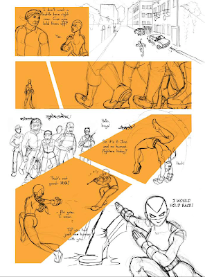
Now that I have a close enough idea of my panel sizes, I start the “penciling” proper – except it’s not, because I use a ballpoint pen now. I pencil on my A3 sketchbook, bearing in mind the ratios of the panels, but not following the layout because I simply can’t. When carried away by the
energy of the illustration, the last thing I want to do is break my momentum by worrying about
borders. This is the main reason why I dropped the traditional way of penciling a page. I can use the entire sketchbook page if drawing something particularly dynamic, but I do have to be careful: things that will be very small on the page need to be drawn small. This is because detailing changes with the scale, and if I draw something way much larger than it will end up, I may put in too many details – and then while inking I’ll have to improvise the simplification. It’s better to be aware of this right now.
When I’m out of sorts or not properly “tuned in”, my drawing is unmistakeably flatter, my characters stiffer. When that happens, even if I’ve put much work into a pencil, I’ll drop it and do it again, until I capture the life I wanted in it. These pages are going to be around for many years, so it’s worth putting in the extra effort.
Once done, I scan all the pencils and insert them in my layout, each as a separate layers with the blend set to Multiply. Now I can make the panels and their contents work together by scaling,
cropping, moving, in a lengthy process of trying different solutions until it looks right. I often drop panel frames at this point to give the page another dimension: this happened with the 3rd, 5th and last panel here. I may veer away from my original layout: on the second row, where there was supposed to be a single long panel, I not only flipped the image but also divided it into two panels continuous with each other. It just felt more logical to see Malaak waiting before we see what is coming towards her, and adding a gutter creates a pause, slight as it may be – a better
alternative in this case to adding a panel to show the wait. I broke the diagonal into two frames that aren’t completely aligned, looking for the most dynamic combination of shapes I could use then. I made some pencils break out of the frames, as I often do, for different reasons. In panel 6, it’s simply dynamic and it expresses well her movement to escape the bullets shot at her – and it fills a problematic empty space in that corner of the triangle. In panel 7 on the other hand, the eye is led through the gun fire to her, through her body’s curve and out her foot to the next “frame”, which isn’t even framed. Note that I sketched that foot directly in my Photoshop file. There are often corrections to be made in the sketches, as well: a head that’s too large, characters placed too far from each other, a face that just doesn’t look right that I have to redraw digitally...
STEP 5 Speech Bubbles
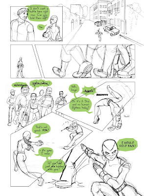
When I’m sure I don’t want to make anymore changes, I flatten all the pencils on a single layer, load all my shapes as a selection and stroke them on their own transparent layer.
I can now add my speech bubbles. I could equally well do this after inking, but you never know
if something unexpected comes out of their placement. I use the Pen tool and draw the circular shapes first, adding the “mouthpiece” afterwards. This way the shape keeps its consistency.
Much can be done with speech bubbles, little of which is used in this page. When you plan them into your composition, you can make them act like a layer, that may slip behind characters or
objects or cover them, depending. A bubble can protrude from a frame (panel 1), which helps
breaking the grid, share a side with it, or create an opening in the frame where it is tangent to
it, so that the white of the bubble and that of the gutter are connected (I use this frequently in other pages). They can be stroked with a varying width for extra dimensionality. That’s not even going into the expressive potential of the bubble, where one can get super creative –just keep
in mind that making them legible is the priority. On this page alone there are 4 different bubble
shapes: the default “broken ellipsis” I use, the Jinns’ rough speech, the “burst” bubble that signals shouting, and in the last panel, a more angular one meant to show a change for the harder in her tone of voice.
Note that I keep them as compact as possible, and they are carefully placed to contribute to
meaning and to directing the eye properly. You don’t want something to be read before an action when it’s supposed to follow it, or vice-versa. Their placement must also be aesthetic in relation to the frames and characters. The rule that goes for the placement of drawn elements also goes for speech bubbles: tangents and near-tangents must be avoided, and replaced by slipping one
element behind the other (panel 1) or moving them further apart (panel 7).
Presently I load the bubbles as a selection and stroke them, as well, on their own layer.
 STEP 6 Inking
I don’t ink digitally. I need the same physical freedom to ink as I do to sketch, so I print out the whole page (over 2 or 3 A4 sheets, since it’s A3-sized) and tape it to my work surface. Over it I
tape a single sheet of tracing paper, and set to work using Faber Castell Ecco Pigment ink pens. They are my favorite because their tip is closer to felt than plastic, making the inking an almost sensual experience and allowing for less mechanical lines.
Why, you might ask, don’t I just ink over the pencils and scan that in once and for all, instead
of printing them out again? The reason is consistency. My pencils are all over the place and not
proportional to each other. Some will have to be shrunk to 20% of their size on the final page,
others will be enlarged. If I inked them first, then scaled them haphazardly, the line width would be widely inconsistent throughout the page. The amount of detailing would be equally inconsistent: a tiny figure could end up more detailed than a larger one. Since the page has to work as a single composition, it must also be inked as a single composition. My way ensures harmony of the whole, which will eventually shrink quite gracefully onto paper.
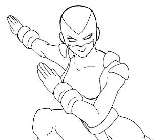
The inking has two stages. First I just ink the sketched lines, using different pen thicknesses according to how close the subject is to the “camera”. I err on the thinner side there, because the second stage will thicken most of them. This first stage of inking looks like this:
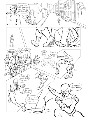
Then I go back over everything, introducing variation in the line width (compare with the above). There’s more than one way of doing this. I learned to thicken lines where there is tension, especially in a body in action; others do this where there should be shade. I do a little of both: my concern is for it to look good and dimensional, and to lead the eye where it should be. I don’t use the Pen tool and Stroke Path method (if you don't know what that is, ask me below) because good lines require a knowing eye, not a computer’s blind execution of a command.
I scan my tracing paper, again in several parts, and knock out the white background. I can then
place it neatly over the pencil, delete that layer, and then retouch where necessary. Some portions of frames or bubbles have to be deleted. Once I’ve made sure the lineart is perfect, I merge the lineart, frames and bubbles into a single layer. I need to do this to make coloring as hassle-free as possible.
 STEP 7 Coloring
Rather arbitrarily, I consider this to be divided in two stages:
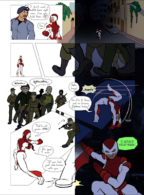
Flats: This is pure “donkey work”, just clicking away till all the flat colors are in place. I have
my colors on a separate layer underneath my Lineart layer. The process is basically selecting
all the shapes on the page that need to be filled with a given color, and fill them on the Color
layer. I created a Photoshop action so I can do this without repeating useless clicks endlessly.
The digital coloring process is fundamentally different from coloring on paper in that you need
all your lines to close neatly, in order to be able ot select and fill a color surface. On paper, you can have your lines as loose as you want and it won’t affect ow you color them later. On screen, loose lines mean a lot more work. I believe this technical detail has defined the graphic style
that dominates mainstream comics today.
Textures: A few touches of texture add visual interest to the page, and makes up for the simplicity of the lines. A recurring example in this comic is my use of manipulated photos as backgrounds (not in this page though). In order to integrate them to the illustration, I reduce them to greyscale, increase the contrast, and colorize them with the Brush tool – the limited palette makes them blend in better with the rest of the page. The texture in the dark margins here actually is a photo, but used as an abstract, indistinct, “something-there” that is much more dramatic than a flat hue. Other textures, such as the brickwork in a wall, can be photographic, or they can be created using Photoshop brushes (like the flowery bush in the second panel, to the
left). The simplest texture to create, but which is enough to add depth when used smartly, is the gradient fill. I use it frequently where I don’t want a background but a flat color is just too flat.
STEP 8 Rendering
I’m not sure if this is an industry term, but this is how I refer to the final steps of applying shading and highlights, and special effects if applicable.
I use cel shading, meaning hard-edged shading, because it’s so much faster to work with, and
my style is simple enough to agree with it. I have brought up the time factor before, but it’s essential to accept the fact I can’t spend forever on each page, and look for ways to work quickly that won’t look rushed. So with a hard brush, I paint in the shadows directly, on a separate layer which is set to Multiply. The opacity varies between 40 and 60%, depending on how harsh I want the shadows on that page. In general, I paint each shadow in the color of the area I am shading. It’s another quick fix but the result is very pleasing. For night scenes however I use a single dark blue, as the little shadow there is there would have to look flatter. There’s much room for experimenting and I’m learning as I go. I always use soft brushes for highlights though. It just looks too cartoonish if they are hard edged.
Special effects, like textures, can be created using simple brushes. I don’t use premade Photoshop brushes – the most useful are those that are most versatile. There are less than 10 brushes I use for everything. Tweaking the brush presets, flow and opacity gives me all the range I need.
For Malaak’s energy bursts, I use the Colour Dodge and Linear Dodge layer modes a lot, and
often use several layers on top of each other until I like what I see. Sadly, there is no tried and
true way for me to do it: I have to try different combinations for each page, as the background color and value affects the result of the blend modes...
Other small elements that may be added at this stage are sound effects, speed lines, bursts,
blurs... The more action, the longer the list! Quieter scenes are as much a breather for the reader as they are for the character – they certainly are for me!
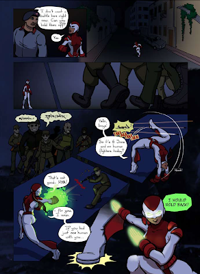
That’s a wrap for this walk-through, as the page has reached its final state. The complete process, uninterrupted, would take 2 or 3 full work days, but it usually spreads over 2 or 3 weeks. Drop me a comment is this has helped you in any way :)

2 comments:
Love your work, I accidentally came across your blog and Malaak, Angel of Peace comics, and i LOVE it!
It's always great reading about ur work, and more specifically ur work process.
cheers :)
Thanks for dropping me a note, Simon! I hope you keep enjoying the comic and the blog :)
Post a Comment